Draft Digipak- Lana Del Rey 'Born to Die'

I created a draft edit of my digipak by using the computer program Adobe Photoshop to edit and alter my photographs, images and text. I hadn't used the program before and therefore it was very time consuming to create this as I had to experiment with the different tools and use tutorials on YouTube to help me work out certain editing skills.

The front cover- I wanted to make the cover stand out as the most creative page on the digipak as this is the part of the digipak that catches the consumers eye. I decided to take photographs of Georgina from different angles doing different poses to portray emotion. I wanted the center photograph to be her facing forwards in order to engage with the audience through eye contact with a serious face but not too stern. I then tried a mid shot of her facing the side holding her hair back, as this relates to the dancing in our music video and also gives the impression of stardom as it isn't a pose general people do. I then opted for another shot to the opposite side to enable that the images would blend together well, and asked Georgina to put her hand to her face and look down as it displays sad emotion which links to the deep title of the album. The background for the page was created by using a photograph I took of Wollaton Hall when out on location as I admired its grand structure and design. I made the background black and white by changing the colour settings to grey scale and selecting the image. I feel that the idea of a photograph in black and white as the background of the front cover works well, however this image in particular is not the best option as it takes your attention away from the artist, who should be the main focus. I will improve this by choosing a more subtle background image. The text is in capitals to make it easier to read, and the colours are dark grey to blend in with the grey scale effect, however I feel that it is not clear enough with the background, and will change the colour perhaps to red to match the models lipstick.

I used an image I took at church and grave yard in Long Eaton as I felt this was an appropriate location for the title of the album 'Born to Die' as the grave yard represents death. I wanted the main attention of the image on the church as it is a traditional building and I did this by using the blur tool and blurring the edges of the image until the center was the main focus. I decided that the colour scheme for my digipak would work best in monochrome as the black and white effect gives the impression of vintage, and also deep saddened meaning which the songs on the album often have. The track list is in white as this stood out against the background better than the black text that I originally tried. I decided to do an uneven layout of the track list as it isn't the usual layout, and as Lana Del Rey is quite quirky, I felt this would represent her style well. I included the record label logo that she is signed to as this was present on all of the digipaks that I researched, along with a barcode in the corner.


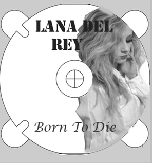
I feel this is the most unsuccessful page of the digipak, as it does not look professional and the idea of using one of the images from the front cover blend was not as effective as I had hoped. I still like the idea of using an image of the artist on the CD as I feel this will be more original than existing media texts. I also feel my editing skills were not great on this page as the edges of the CD are not smooth and the photo is poorly cropped.

I did this page as just a simple image as existing digipaks sometimes do this as it can be simple yet effective, and I like the contrast I have created by using a different background which is the Toton Park location, and a clear photograph, however I think it needs some text on it so that it looks more impressive.
Experimenting on Adobe Photoshop
I started by learning to crop around an image, and then placed these layers on top of each other, whilst having a transparent background, which I then changed to a block colour, before resorting to an image I took of Wollaton Hall.


I added the text and changed the font at the top, making sure it was easy to read and visible.
No comments:
Post a Comment