Showing posts with label Construction. Show all posts

Tuesday, 5 November 2013

Draft Magazine Advert

Draft Magazine Advert


I want to keep my magazine advertisement simple as from my research of existing magazines in this genre, I can see that they rely on a clear image or artwork, with a bold title, artist's name and release date, with record label logos and a possible website. I do not feel any other information is necessary if this poster would be printed in the same magazines as the ones I analysed. I used the same photograph blend as I created and used for my digipak front cover. I did this as I feel it will be a good advertisement technique as it creates synergy between the two media texts, and allows the audience to become familiar with the image, perhaps becoming a motif for this particular album. The only thing I want to improve is the sizing of the text as I feel that the release date looks too big and bold on the advert.

Monday, 28 October 2013

Filming at Toton Park

Filming at Toton Park


We planned to have some flashback shots which were filmed in the Summer, however it was Autumn when we were filming, and it was difficult to get the correct lighting. I was free on a day which was surprisingly sunny, and therefore asked Georgina to do some filming whilst we had the opportunity. Most of the shots I allowed her to act natural so that it appeared to be coming from somebodies point of view, so that she looked happy. I particular like the shots I did of her laughing as these will look effective in slow motion to the song. 

Photos from the shoot


I styled her in Summer clothes, however still made sure she had the retro chic style which we had been creating throughout the video, and this worked well with a baseball top and skirt with some sunglasses to demonstrate the season.

Thursday, 17 October 2013

Draft Digipak

Draft Digipak- Lana Del Rey 'Born to Die'


I created a draft edit of my digipak by using the computer program Adobe Photoshop to edit and alter my photographs, images and text. I hadn't used the program before and therefore it was very time consuming to create this as I had to experiment with the different tools and use tutorials on YouTube to help me work out certain editing skills. 

The front cover- I wanted to make the cover stand out as the most creative page on the digipak as this is the part of the digipak that catches the consumers eye. I decided to take photographs of Georgina from different angles doing different poses to portray emotion. I wanted the center photograph to be her facing forwards in order to engage with the audience through eye contact with a serious face but not too stern. I then tried a mid shot of her facing the side holding her hair back, as this relates to the dancing in our music video and also gives the impression of stardom as it isn't a pose general people do. I then opted for another shot to the opposite side to enable that the images would blend together well, and asked Georgina to put her hand to her face and look down as it displays sad emotion which links to the deep title of the album. The background for the page was created by using a photograph I took of Wollaton Hall when out on location as I admired its grand structure and design. I made the background black and white by changing the colour settings to grey scale and selecting the image. I feel that the idea of a photograph in black and white as the background of the front cover works well, however this image in particular is not the best option as it takes your attention away from the artist, who should be the main focus. I will improve this by choosing a more subtle background image. The text is in capitals to make it easier to read, and the colours are dark grey to blend in with the grey scale effect, however I feel that it is not clear enough with the background, and will change the colour perhaps to red to match the models lipstick.
I used an image I took at church and grave yard in Long Eaton as I felt this was an appropriate location for the title of the album 'Born to Die' as the grave yard represents death. I wanted the main attention of the image on the church as it is a traditional building and I did this by using the blur tool and blurring the edges of the image until the center was the main focus. I decided that the colour scheme for my digipak would work best in monochrome as the black and white effect gives the impression of vintage, and also deep saddened meaning which the songs on the album often have. The track list is in white as this stood out against the background better than the black text that I originally tried. I decided to do an uneven layout of the track list as it isn't the usual layout, and as Lana Del Rey is quite quirky, I felt this would represent her style well. I included the record label logo that she is signed to as this was present on all of the digipaks that I researched, along with a barcode in the corner.

The first inside image is usually quite subtle on a digipak, and I tried to give this impression by simply changing the background to a photograph I took out on location at Toton park, and altered the colour mode to grey scale to match the rest of the images on the digipak. I photographed Georgina in dance wear consisting of a crop top and high waisted shorts, and gave her a cloak styled garment to create movement within the costume. I thought that this shot would tie in well with the dancing pieces we filmed for our music video, however after seeing this page on the digipak, I feel that the image does not represent the artist well as an alternative rock singer, and the image is slightly blurry. To improve this page I will take new photographs of Georgina in more casual clothing to represent the correct genre of the artist. I have also had the idea to take two close up images of her face, so that it will divide the mouth and eyes and I can write a thank you note from the artist like I saw on the Example digipak I researched, as I feel this is a good way to make it seem more personal to the consumer.


I used this image as I feel the position she is in and the face expression, represents her star quality as it appears to represent the actions of what a diva may do, and the way she is looking away from the camera suggests upset and sadness as she is unable to make eye contact. I wanted this page to be subtle yet meaningful, and that is why I decided to add lyrics from her song 'Video Games' which could be directed to the consumer of the digipak, making it feel more personal and appreciated by fans.

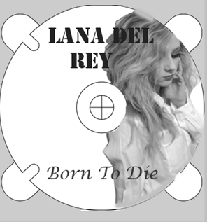
I feel this is the most unsuccessful page of the digipak, as it does not look professional and the idea of using one of the images from the front cover blend was not as effective as I had hoped. I still like the idea of using an image of the artist on the CD as I feel this will be more original than existing media texts. I also feel my editing skills were not great on this page as the edges of the CD are not smooth and the photo is poorly cropped.

I did this page as just a simple image as existing digipaks sometimes do this as it can be simple yet effective, and I like the contrast I have created by using a different background which is the Toton Park location, and a clear photograph, however I think it needs some text on it so that it looks more impressive.

This is the edge of the digipak, and I wanted it to only display the important information which is the artist and album name. I think this could be improved with a more interesting font and colour choice, however it fits in well with the style of the digipak.


Experimenting on Adobe Photoshop

I started by learning to crop around an image, and then placed these layers on top of each other, whilst having a transparent background, which I then changed to a block colour, before resorting to an image I took of Wollaton Hall.


I added the text and changed the font at the top, making sure it was easy to read and visible.

Friday, 11 October 2013

First Draft of music video

First Draft Music Video


I was happy overall with our first draft music video, as I feel the shots worked well together and the narrative was understandable for the audience. I particularly was impressed with how well the different costumes and make-up/hair worked on the camera, as I feel this makes the video more interesting.

I personally feel that the lighting could be improved in all areas of the video, as the outside scenes at the park do not appear to be bright enough to represent summer, and all of the other outside scenes look dull. I will experiment with different colour contrasts on the different shots until I am happy with the result. I also think that the singing performances against the blank wall need different lighting so that the wall appears to be more white than cream, and maybe try filming the singing in another location with a different camera angle, to mimic Lana Del Rey who does hers in different costume and camera angles. Some of the lip syncing could also be improved as slightly off at times. I want to make the dance scenes slightly slower so that it emphasises the beautiful shapes she makes in the air more, rather than it being unappreciated.

Thursday, 26 September 2013

Filming at the train station

First Filming Session


We filmed the shots which were located at Beeston train station on our storyboard on 25th September, and styled our actress to look sophisticated, stylish and slightly retro with the hair and make-up. We looked at our moodboard for inspiration of the costume and hair/make-up which would look best at this location, and styled her hair and make-up like this.

Before

 Doing her hair style: I styled a retro roll at the front of her hair which looked really good on the footage, and Laura-Jo curled her hair to make her look more like a star and less ordinary. We felt that we needed to add a hairband behind the roll to make her hair look more interesting.

 Doing her make-up: I did her make-up by applying natural foundation and blusher, but emphasising her features such as eye brows, eye lashes and lips which we painted red. This made her seem more natural which was the style we wanted at a casual location, but still showed she is glamorous.
 After


 At the location

Costume: We planned for Georgina to wear something sophisticated with an edge for these shots, and after looking at the images on the mood boards we previously created, decided on a white shirt as this is classy, with jeans to make the costume more casual for the location. We originally put a brown satin jacket on Georgina, however after seeing her on the location, decided she looked too dressed up and opted for a more casual blazer which still made her look sophisticated. She wore wedged heels as these give her star image at a location which we wouldn't expect people to necessarily wear heels at. The only prop she has at this location is a brown leather tote bag as it makes her look like she is living her every day life.


Problems: The issues we faced on the day we filmed these shots were that it began to rain heavily as we started to film, however we waited until it calmed down and as the station was sheltered we were able to continue. The theme of our music video about summer being over worked well with this lighting anyway. We also had to try and avoid people getting in the way of shots as they got of trains or walked down the station, however as we filmed on a Wednesday morning it wasn't too busy.


Snap shots from the footage we took:

We filmed from the same platform as Georgina in this shot, and as she walked past the camera it showed her costume, and we asked her to stop at a certain position and turn to look for the train so that we are able to see her face and sad expression, before she continues to walk down the platform.

We also did a few shots from the opposite platform to show her in long shots, walking across the platform reminding the audience of the current location.


We waited for some trains to arrive to make the location clear for the audience, and in this shot the train goes past without stopping and shows Georgina on the opposite platform.


This shot was not planned, however we thought it might be interesting to involve a handheld shot in the music video to make it feel more personal to the audience. I followed her walking with the camera which gives an eerie sense of somebody following her.


Another hand held shot that we tried out was a close up of the platform sign, which could be put into the music video to look like it is the artists own footage as Lana Del Rey often involves her own videos into her music video, again making the video more personal.