Final Digipak
This is my final digipak, as I changed elements of my first draft to improve the overall product. I decided to stick with the black and white colour scheme as this looks effective and keeps in tone with the songs on the album, however I added red to the colour scheme as this gave the text more boldness which allowed the important information to stand out to the consumer. The two gaps at the top of the digipak are due to the construction as I used a template for dimensions of the digipak and it left these two gaps free as when you construct the album they go beneath the other two spines. I also took new photography for some of the pages as I felt some of my previous ones were not as clear as I wanted them to be.
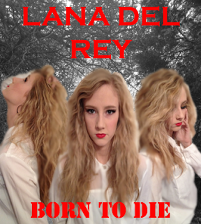
I thought the three images blended together worked well and therefore decided to keep this image on the front cover, however I blended it more with the blur tool so that it gave a more eerie effect when on top of the background. The image to the left involved her arm near her face as her hand is in her hair, although I have been informed this is not obvious, so if I were to improve this page, I would remove that small section of the image. The text on the front cover has been changed to the red font, as this combination of colours works well, particularly on the cover as the red lipstick matches it. I feel this makes it stand out more and the information is more memorable. I also changed the background to an image I took on location in Toton Park, as I feel that it is more subtle and therefore doesn't distract from the artist's image.
I loved this photograph on the back page and therefore left it the same, although I altered the sizing of the track list due to it covering the majority of the image, and I like it better now as I feel it is more like existing digipaks I have researched and analysed. I also added a credit block, as all CD's have these on the back including information such as record companies so that the consumer can be fully aware of it.
On my draft digipak, I disliked how I approached this page, however after redesigning it, I managed to create something unique which looks rather effective. Not many discs include a whole photograph of the artist and therefore I did mine like this to be original and to stand out from the rest. I also think it would be more personal to the consumer rather than a blank disc with writing on.
I was inspired by Lana Del Rey's cheekier side which I have seen in the music videos such as 'Video Games' where she winks to the camera, and other media texts of hers I have studied, and as we interpreted a shot in our music video where Georgina runs her tongue across her teeth, I wanted to continue this side of the artist on the digipak. I took two different images, one of her eyes which are slightly squinted to give the impression of a sexualised stare, and another photograph of her licking her lips. I then positioned these so it looked like one continuous photograph with text in the middle joining them together. I did this instead of taking one photograph as I felt it was more creative and alternative suiting the genre. The text was inspired by my previous research on Example and DJ Wire's digipak where they did a page with thank you messages on them, and I felt this was different and a good way of connecting the artist with the audience, so therefore I included it on this page.
Previously on my digipak draft, I had the same lyrics, but on a different photograph, and this photograph was on it's own without any text. As I preferred this photograph, but felt it needed more text, I combined the two to create this lyric page. I think it works a lot better with the lyrics along with this photograph as there is a more distinct background to the page as well.
I decided to take new photographs against a different background, and found a brick wall as I feel these are often used in the background of more urban and alternative acts. I just wanted a simple photograph which was effective on it's own and didn't require any text. I used this as I feel her facial expression really connects with the audience and you can understand the tone of the album through her face.


No comments:
Post a Comment